Brand identity, marketing materials, website and more from Axiom Optics


Client : Axiom Optics


Activities: Create a brand identity consistent with the company's business. Define a graphic charter and deploy it by creating print or web communication materials. Redesign the website. Design stands for trade shows.


Result: Complete brand identity, graphic charter, rebranded website, UI kit, graphic toolbox, print (trade fair stand, banners, business cards, flyers, etc.)

qqq


Axiom Optics is a North American distributor of optical instruments. Its dedicated engineering team provides technical expertise, sales, and support. Our product portfolio includes advanced optical microscopy products, cameras and vision systems, laser beam diagnostic solutions, spectrometers, hexapods, wavefront sensors, and adaptive optics solutions.

Color palette

primary colors that recall the decomposition of a light beam.

Typography

Michroma is a typeface with a futuristic and modern look. Despite its distinctive style, Michroma remains relatively legible, especially for headings. Its clear structure and precise spacing contribute to a good reading experience on various devices, including screens. Above all, this typeface gives logos and brands a strong and recognizable image.

Aa

Titre - Michroma Bold

Aa Bb Cc Dd Ee Ff Gg

Hg Ig Jj Kk Ll Mm Nn

Oo Pp Qq Rr Ss Tt Uu

Vv Ww Xx Yy Zz 1 2 3

4 5 6 7 8 9 0 . ! ?

Aa

Subtitle - Regular Michroma

Aa Bb Cc Dd Ee Ff Gg

Hg Ig Jj Kk Ll Mm Nn

Oo Pp Qq Rr Ss Tt Uu

Vv Ww Xx Yy Zz 1 2 3

4 5 6 7 8 9 0 . ! ?

While Michroma brings a touch of originality and dynamism to the titles, Rubik ensures readability and comfort of reading the text.

Despite their differences, these two fonts harmonize thanks to their geometric shapes. Michroma, although more angular, has a certain geometric structure found in the Rubik's cube construction. This creates a subtle link between the two fonts and avoids too much contrast.

Aa

Body text - Rubik's Light

Aa Bb Cc Dd Ee Ff Gg

Hg Ig Jj Kk Ll Mm Nn

Oo Pp Qq Rr Ss Tt Uu

Vv Ww Xx Yy Zz 1 2 3

4 5 6 7 8 9 0 . ! ?

Aa

Sentence case - normal Rubik

Aa Bb Cc Dd Ee Ff Gg

Hg Ig Jj Kk Ll Mm Nn

Oo Pp Qq Rr Ss Tt Uu

Vv Ww Xx Yy Zz 1 2 3

4 5 6 7 8 9 0 . ! ?

Logo design

inspiration diffusion of light

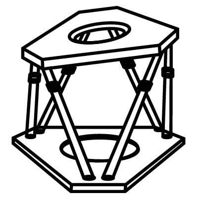
Icon Creation

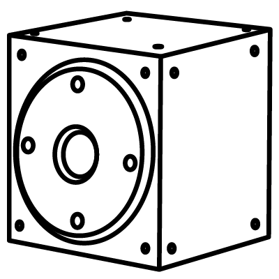
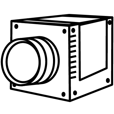
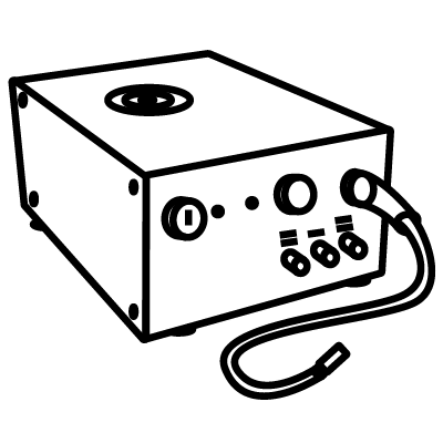
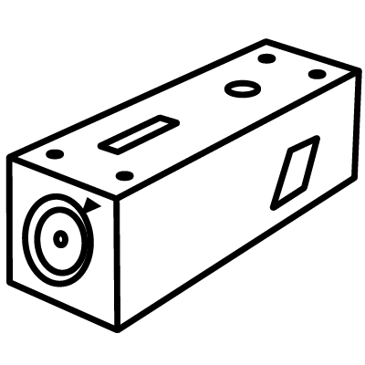
creation of an icon library to illustrate the main product lines marketed by the company, as well as certain company activities such as customer service or after-sales service.

Print

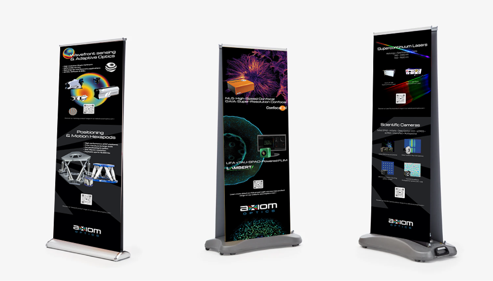
Roll-up banners

Vertical banners designed for trade shows and scientific conferences. Their clean layout and strong visual hierarchy combine high-resolution images of optical components with key messages. The goal was to attract attention from afar while clearly conveying the brand's technical expertise.
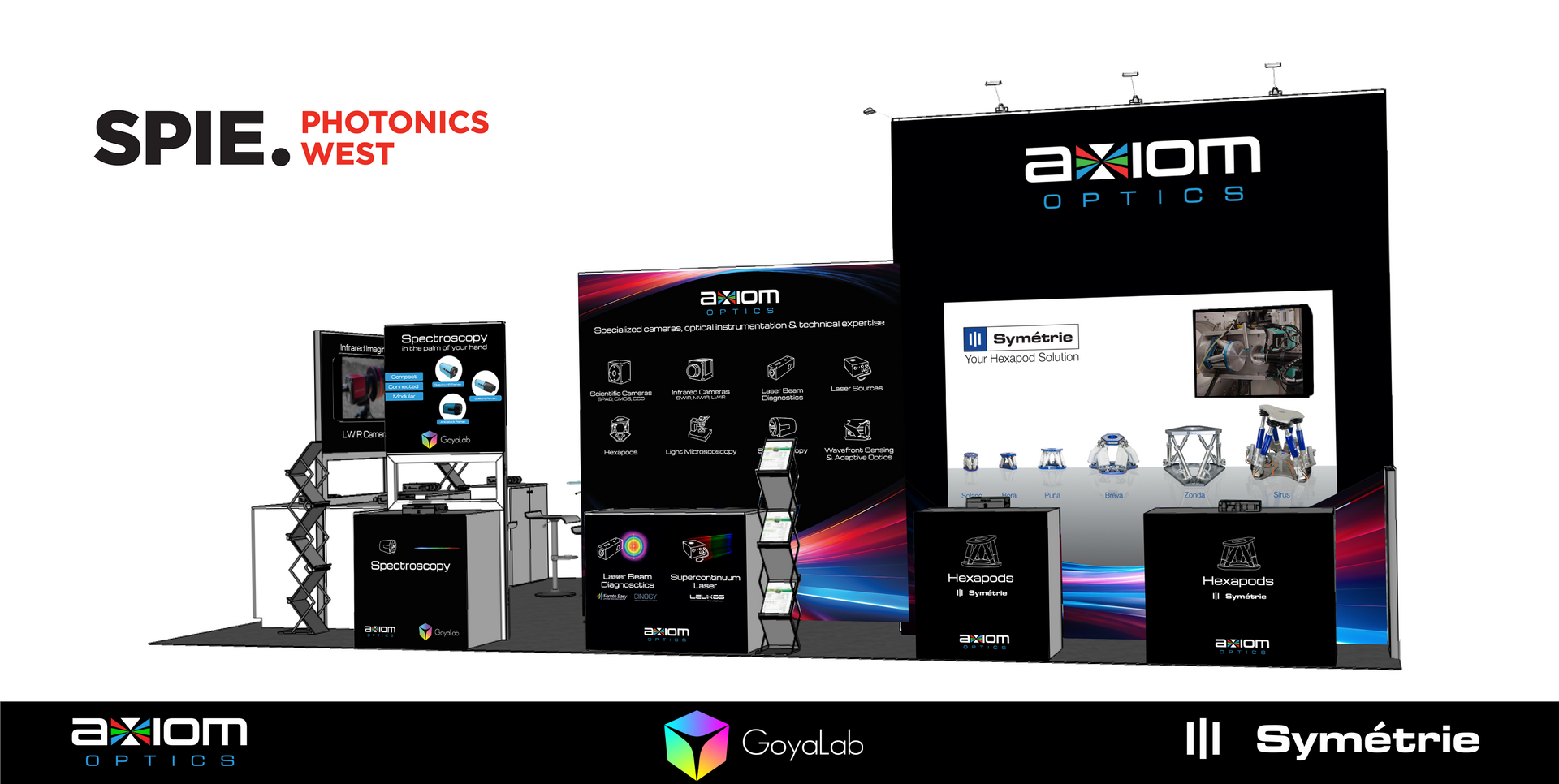
Trade show booths

A modular booth was created for Axiom Optics' presence at science fairs. The design emphasizes visual impact and product visibility, with seamless integration of brand visuals on wall panels and counters. The space was optimized for demonstrations and interactions, improving the flow of exchanges and brand awareness.
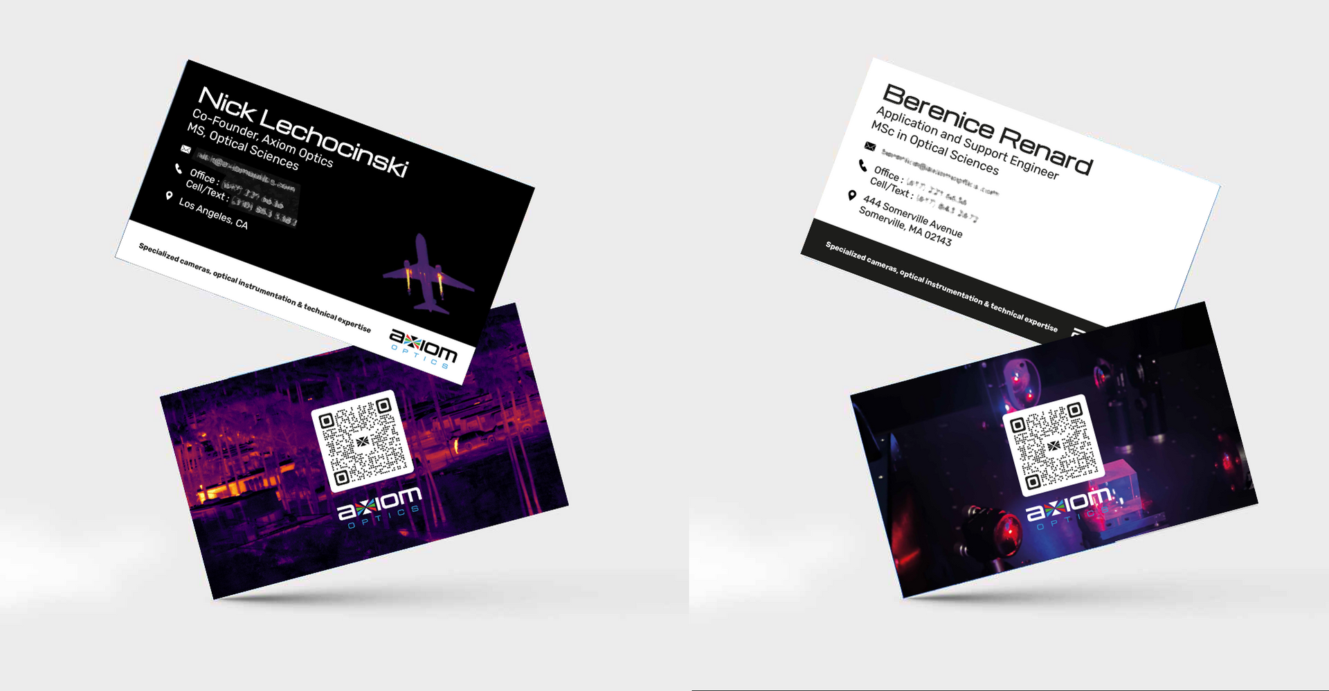
Business cards

A minimalist and professional business card that reflects the precision and clarity of the Axiom Optics brand. The layout prioritizes readability, clean typography, and balanced use of white space for a lasting first impression.
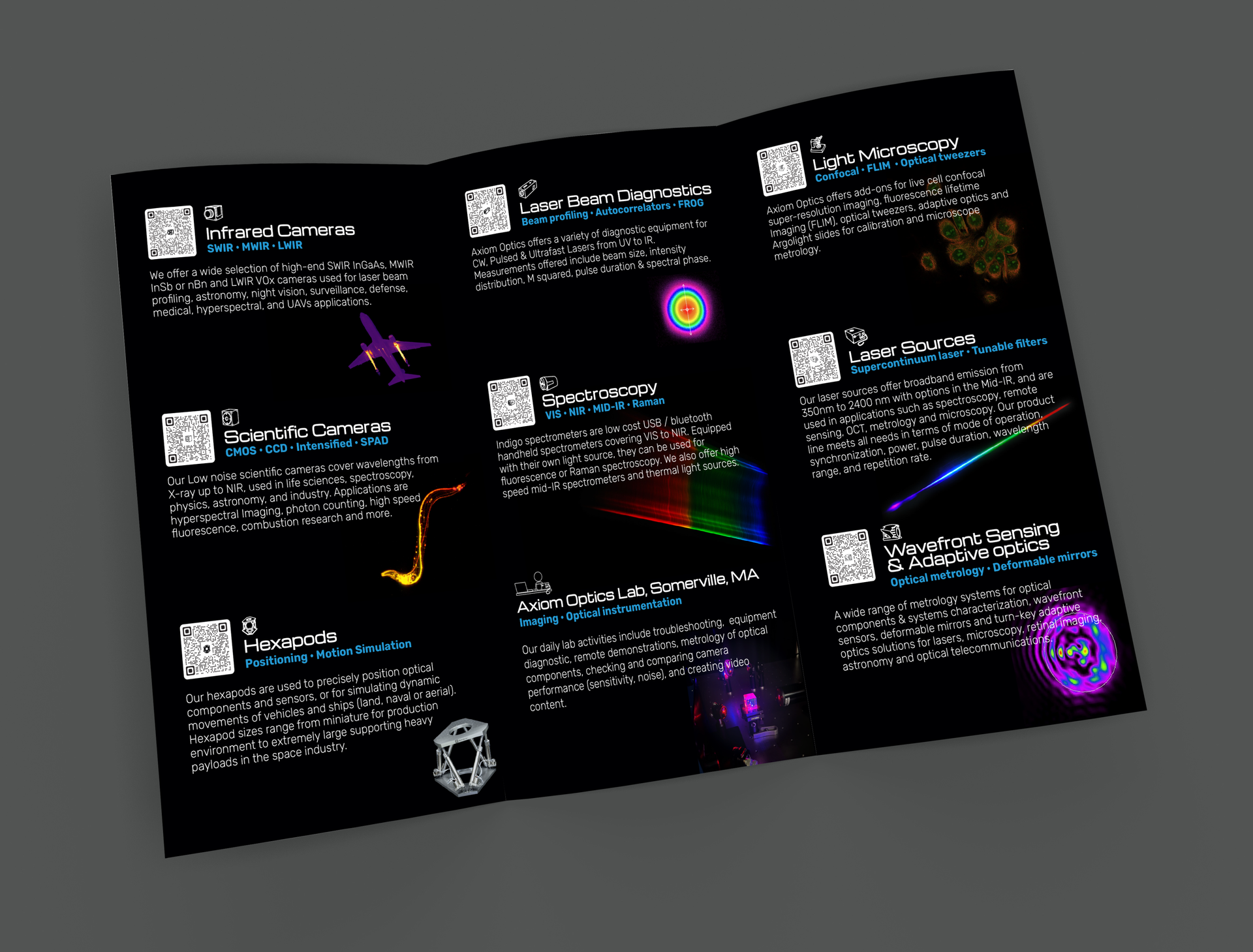
Designed to support sales and technical teams, this sheet includes precise specifications and images of a specific optical instrument. Its presentation is functional and accessible, with clearly segmented data blocks, easy-to-read tables, and annotated diagrams.
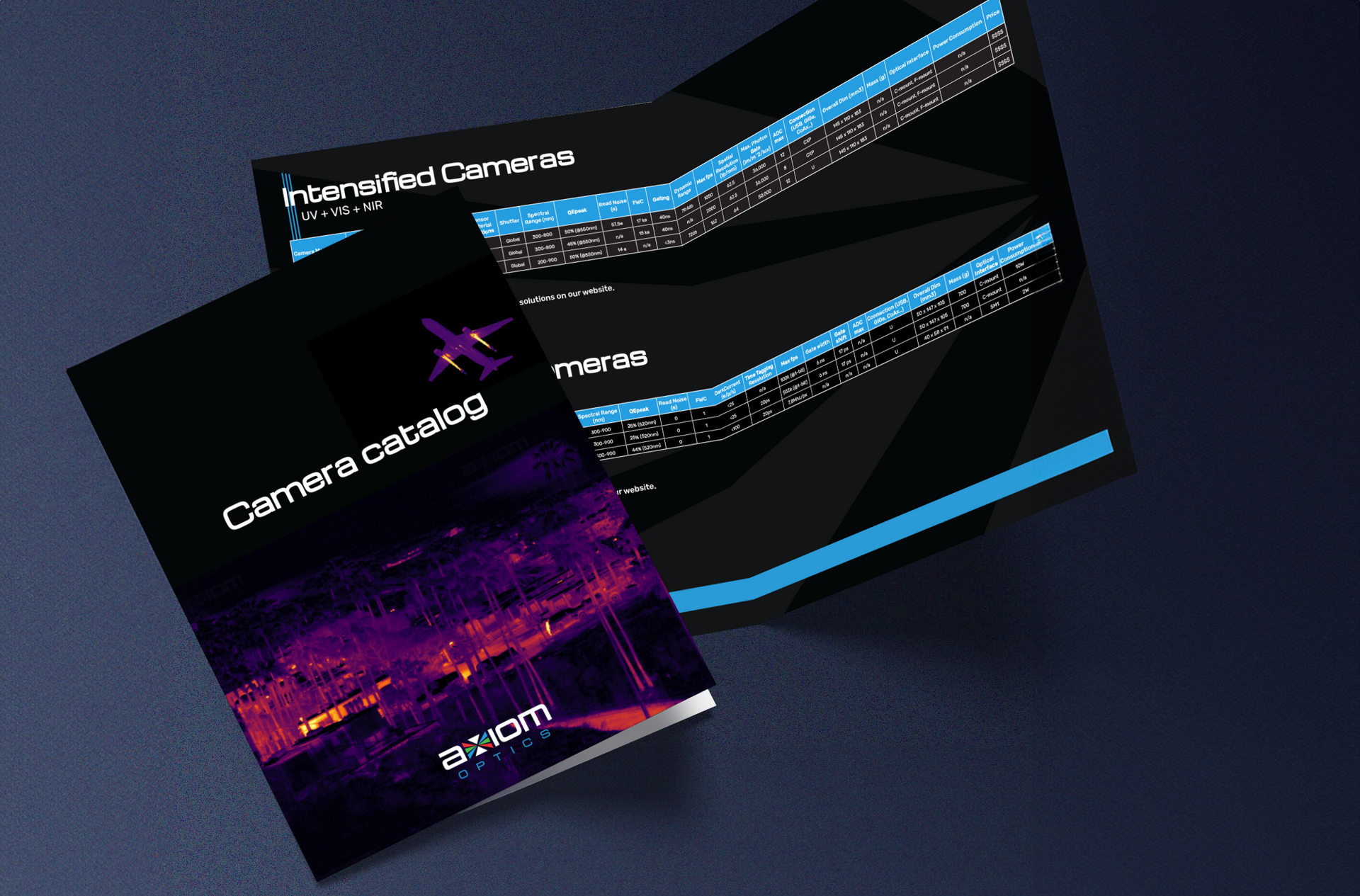
Prospectus

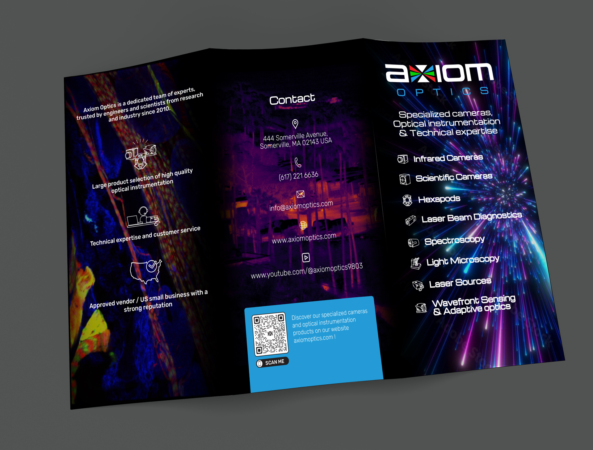
This brochure presents Axiom Optics' main product lines and services. The layout balances text and visuals for optimal clarity, and typographic choices ensure readability. The use of icons and product images guides the reader through the information in a logical and structured manner.


  • Button
  • Slide Title

    Write your caption here
    Button

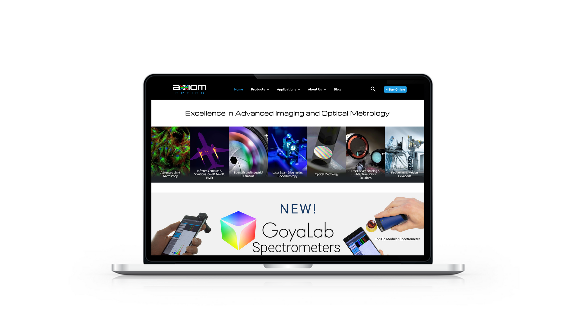
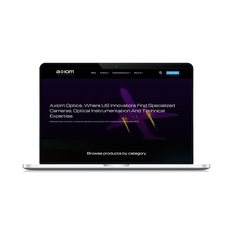
Site web

Landing Page and Blog


Areas for improvement (UX and UI)

1. No clear value proposition

Problem: The page starts with a generic title ("Excellence in Advanced Imaging...") and visuals, but doesn't explain what the company does or for whom.

Suggestion: Add a strong value proposition above the carousel or as an overlay, for example:

“We provide cutting-edge optical solutions for scientific research and industry.”

2. Weak visual hierarchy

Problem: Sections are stacked without a clear visual separation. The "NEW! GoyaLab Spectrometers" stand out, but the surrounding content looks flat.

Suggestion:

Use more visual contrast and white space between sections.

Highlight section headings with larger font sizes and bolder weights.

3. Uncertain mobile experience

Hard to judge from the screenshot, but important to check:

Does the menu collapse properly in a mobile-friendly hamburger menu?

Do image and content blocks resize properly without becoming cramped?

4. Scattered / Low Visibility CTAs

Issue:

The "Buy online" button is clearly visible, but the others ("Learn more", "Buy now") are visually lost.

Suggestion:

Harmonize button design (style, color, placement).

Include a strong CTA above the fold (e.g., “Browse Products” or “Request a Quote”).

5. Accessibility and readability

Problem: Thin, light-colored text on a light background (e.g., "Scientific Optical Equipment") lacks sufficient contrast.

Suggestion:

Improve color contrast (use tools like WebAIM Contrast Checker).

Increase the paragraph text size slightly for better readability.

6. Cluttered footer

The footer contains too much stuff: contact information, social links, product/app listings, partners, etc.

Suggestion:

Organize the content into 2 to 3 structured columns.

Prioritize the essentials: Contact → Social links → Legal notices / Site map.

Before > After

PORTFOLIO UNDER CONSTRUCTION


I have a few projects available for viewing on other platforms. Feel free to check out my profile on Behance or Dribbble.