Identité de marque, support marketing et communication, site Web et plus encore...
Typographie
Michroma est une police de caractères au look futuriste et moderne. Malgré son style distinctif, Michroma reste relativement lisible, notamment pour les titres. Sa structure claire et son espacement précis contribuent à une bonne expérience de lecture sur différents supports, y compris les écrans. Mais surtout, cette typographie confère une image forte et reconnaissable aux logos et aux marques.
Aa
Titre - Michroma Bold
Aa Bb Cc Dd Ee Ff Gg
Hg Ig Jj Kk Ll Mm Nn
Oo Pp Qq Rr Ss Tt Uu
Vv Ww Xx Yy Zz 1 2 3
4 5 6 7 8 9 0 . ! ?
Aa
Sous-titre - Michroma régulier
Aa Bb Cc Dd Ee Ff Gg
Hg Ig Jj Kk Ll Mm Nn
Oo Pp Qq Rr Ss Tt Uu
Vv Ww Xx Yy Zz 1 2 3
4 5 6 7 8 9 0 . ! ?
Tandis que Michroma apporte une touche d’originalité et de dynamisme aux titres, Rubik assure lisibilité et confort de lecture du texte.
Malgré leurs différences, ces deux polices s'harmonisent grâce à leurs formes géométriques. Michroma, bien que plus anguleuse, présente une certaine structure géométrique que l'on retrouve dans la construction Rubik. Cela crée un lien subtil entre les deux polices et évite un contraste trop marqué.
Aa
Corps du texte - Lumière Rubik
Aa Bb Cc Dd Ee Ff Gg
Hg Ig Jj Kk Ll Mm Nn
Oo Pp Qq Rr Ss Tt Uu
Vv Ww Xx Yy Zz 1 2 3
4 5 6 7 8 9 0 . ! ?
Aa
Cas de phrase - Rubik normal
Aa Bb Cc Dd Ee Ff Gg
Hg Ig Jj Kk Ll Mm Nn
Oo Pp Qq Rr Ss Tt Uu
Vv Ww Xx Yy Zz 1 2 3
4 5 6 7 8 9 0 . ! ?
Conception de logo
inspiration diffusion de la lumière
Création d'icônes
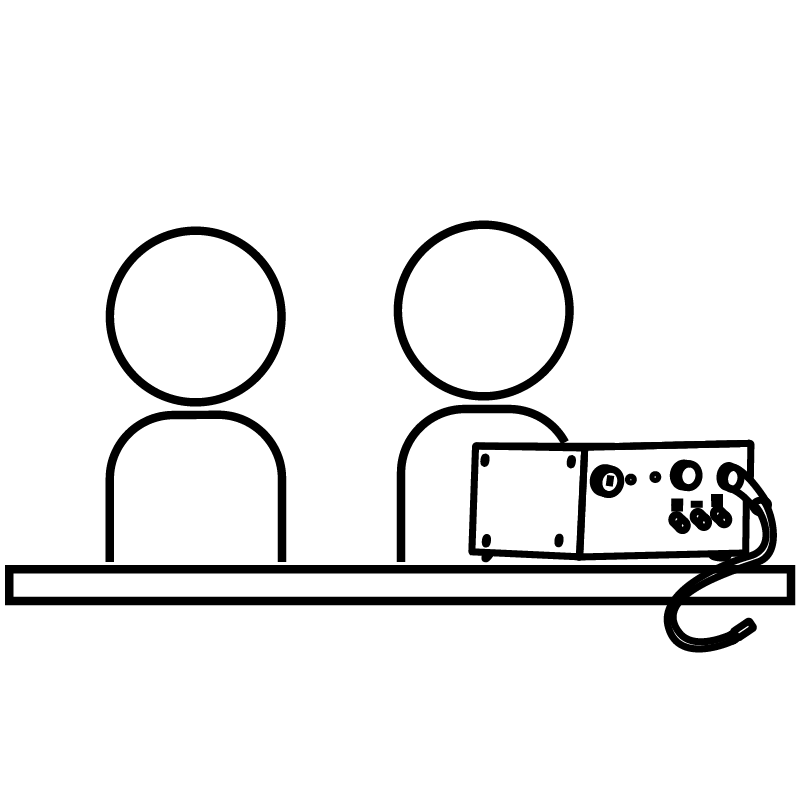
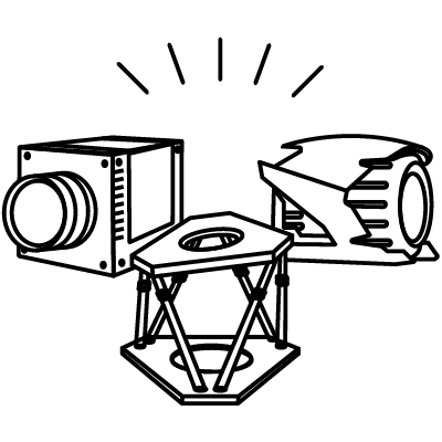
création d'une bibliothèque d'icônes permettant d'illustrer les principales lignes de produits commercialisées par l'entreprise, ainsi que certaines activités de l'entreprise comme le service client ou le service après-vente.


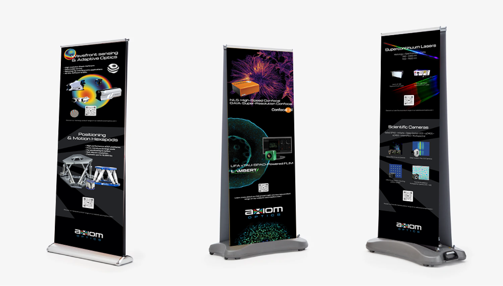
Bannières enroulables
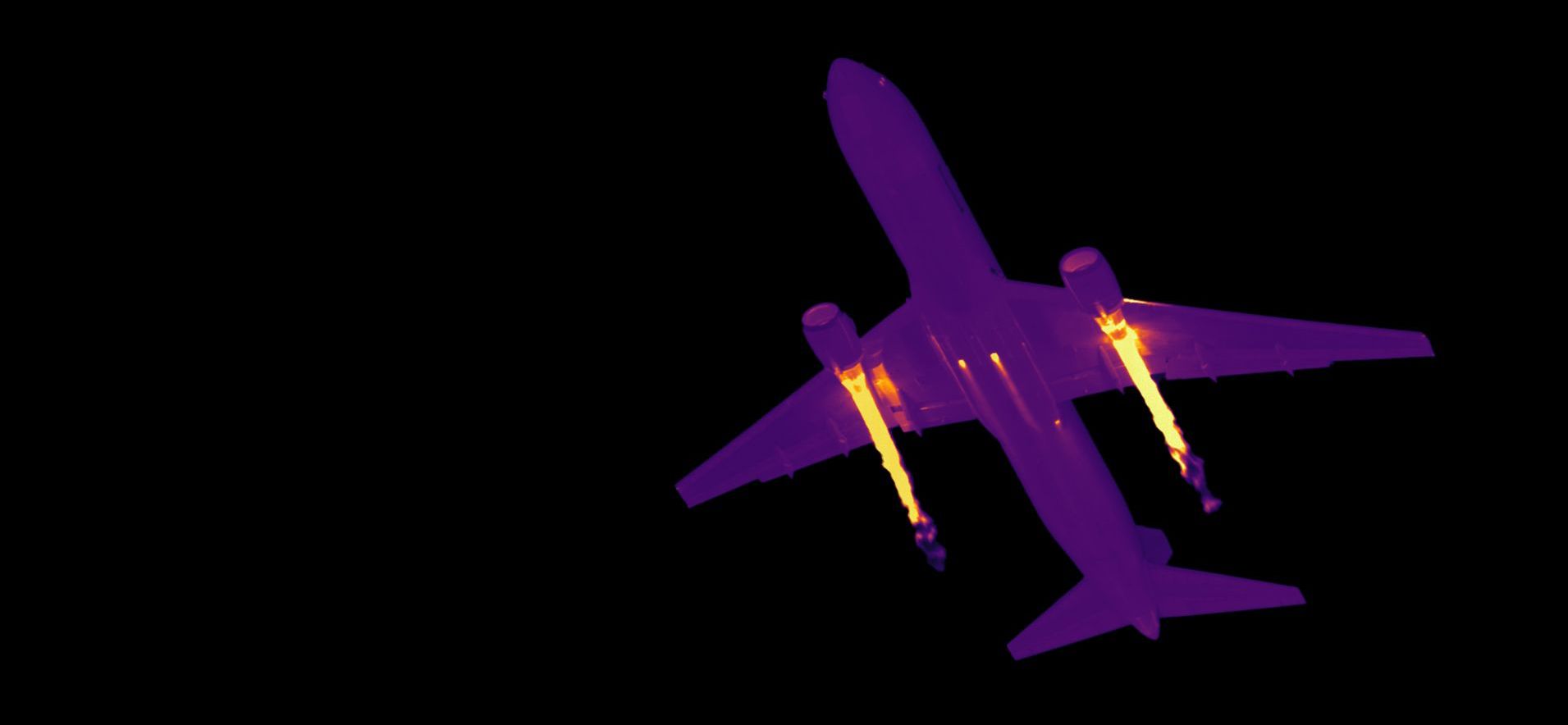
Bannières verticales conçues pour les salons professionnels et les conférences scientifiques. Leur mise en page épurée et leur forte hiérarchie visuelle associent des images haute résolution de composants optiques à des messages clés. L'objectif était d'attirer l'attention de loin tout en véhiculant clairement l'expertise technique de la marque.
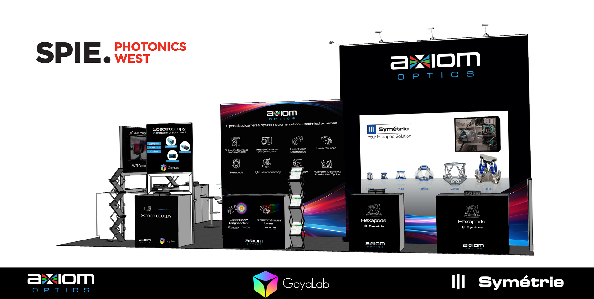
Stands pour salons professionnels
Un stand modulaire créé pour la présence d'Axiom Optics sur les salons scientifiques. La conception met l'accent sur l'impact visuel et la visibilité des produits, avec une intégration harmonieuse des visuels de la marque sur les panneaux muraux et les comptoirs. L'espace a été optimisé pour les démonstrations et les échanges, améliorant ainsi la fluidité des échanges et la perception de la marque.
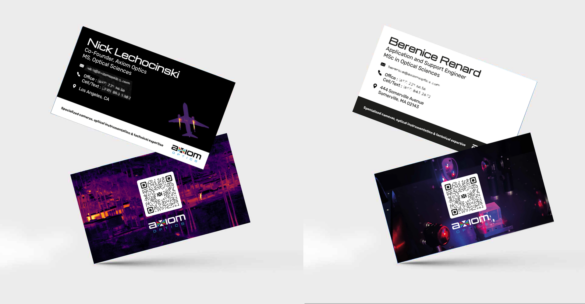
Cartes de visite
Une carte de visite minimaliste et professionnelle reflétant la précision et la clarté de la marque Axiom Optics. La mise en page privilégie la lisibilité, une typographie épurée et une utilisation équilibrée des espaces blancs, pour une première impression durable.
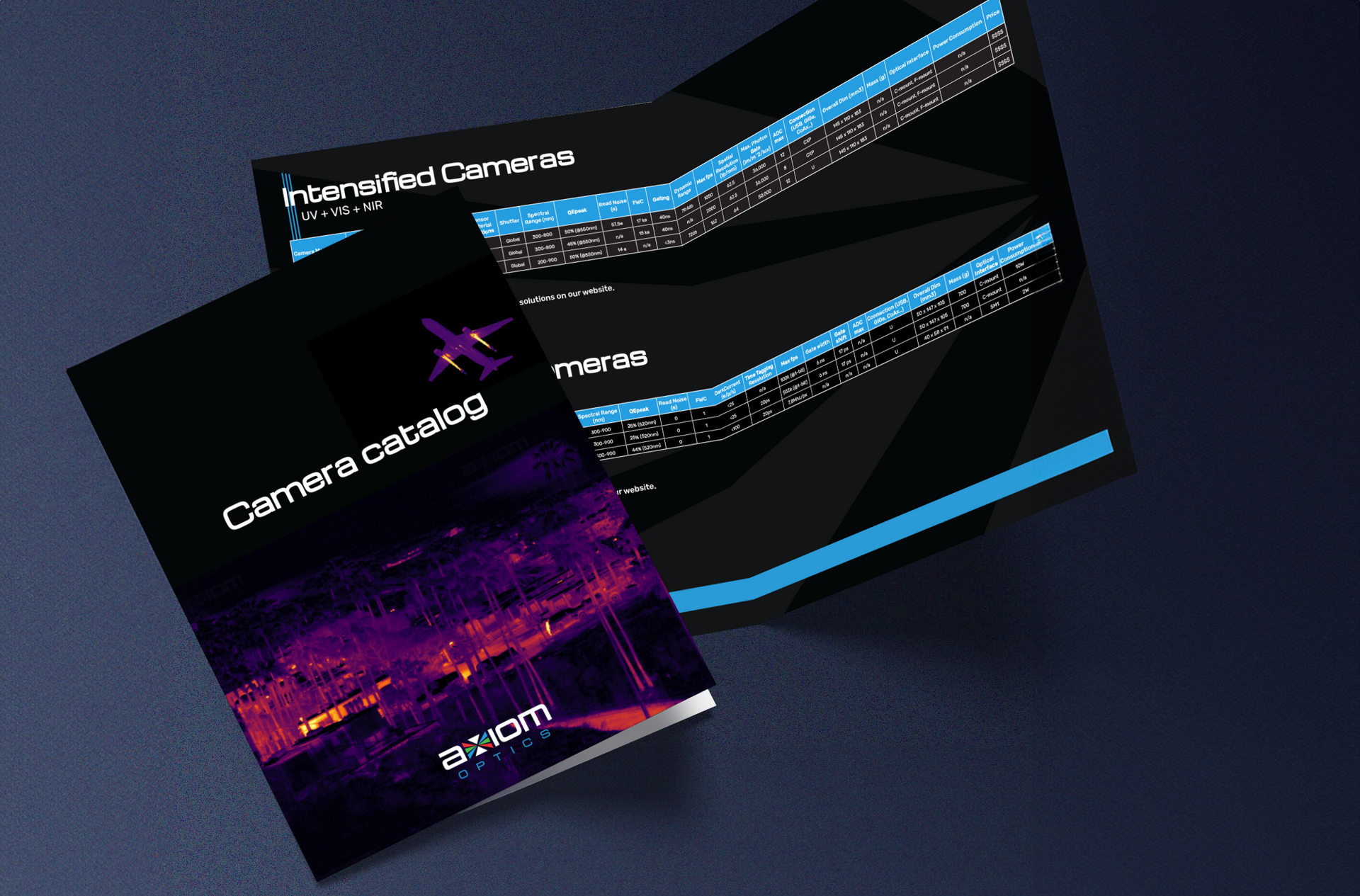
Catalogue
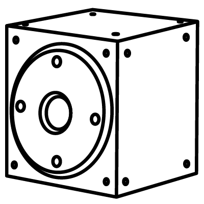
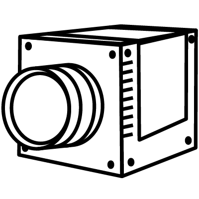
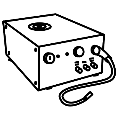
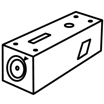
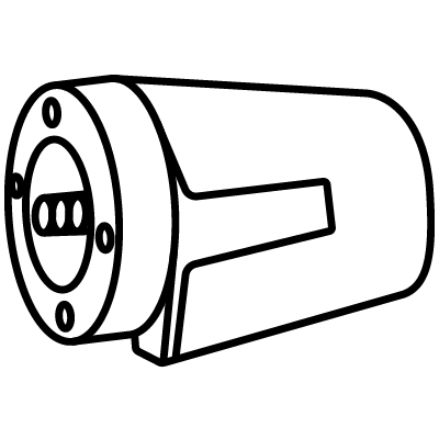
Conçue pour accompagner les équipes commerciales et techniques, cette fiche comprend les spécifications et les images précises d'un instrument optique spécifique. Sa présentation est fonctionnelle et accessible, avec des blocs de données clairement segmentés, des tableaux faciles à lire et des schémas annotés.
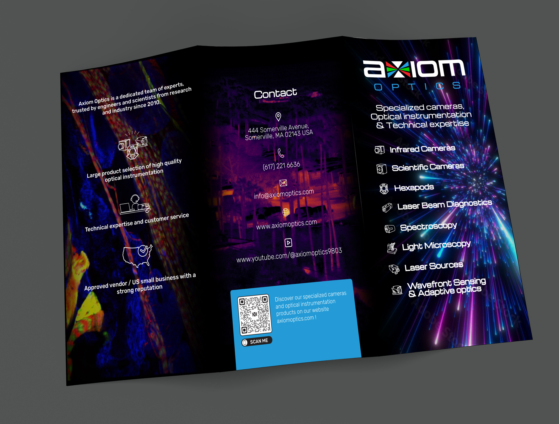
Brochure
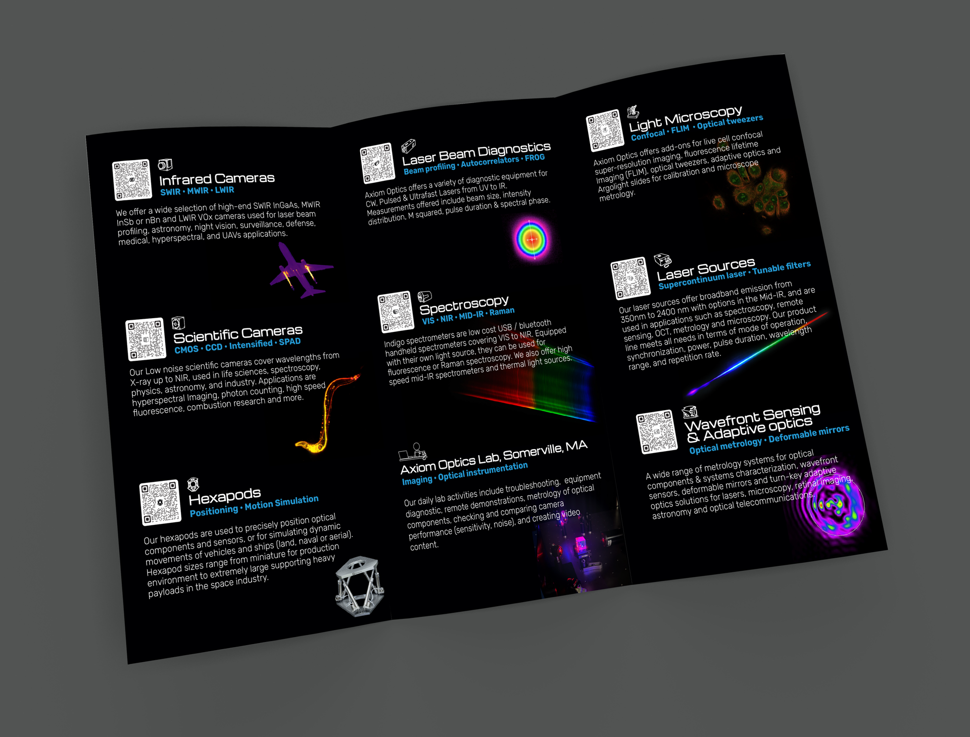
Cette brochure présente les principales gammes de produits et services d'Axiom Optics. La mise en page équilibre texte et visuels pour une clarté optimale, et les choix typographiques garantissent la lisibilité. L'utilisation d'icônes et d'images de produits guide le lecteur à travers l'information de manière logique et structurée.
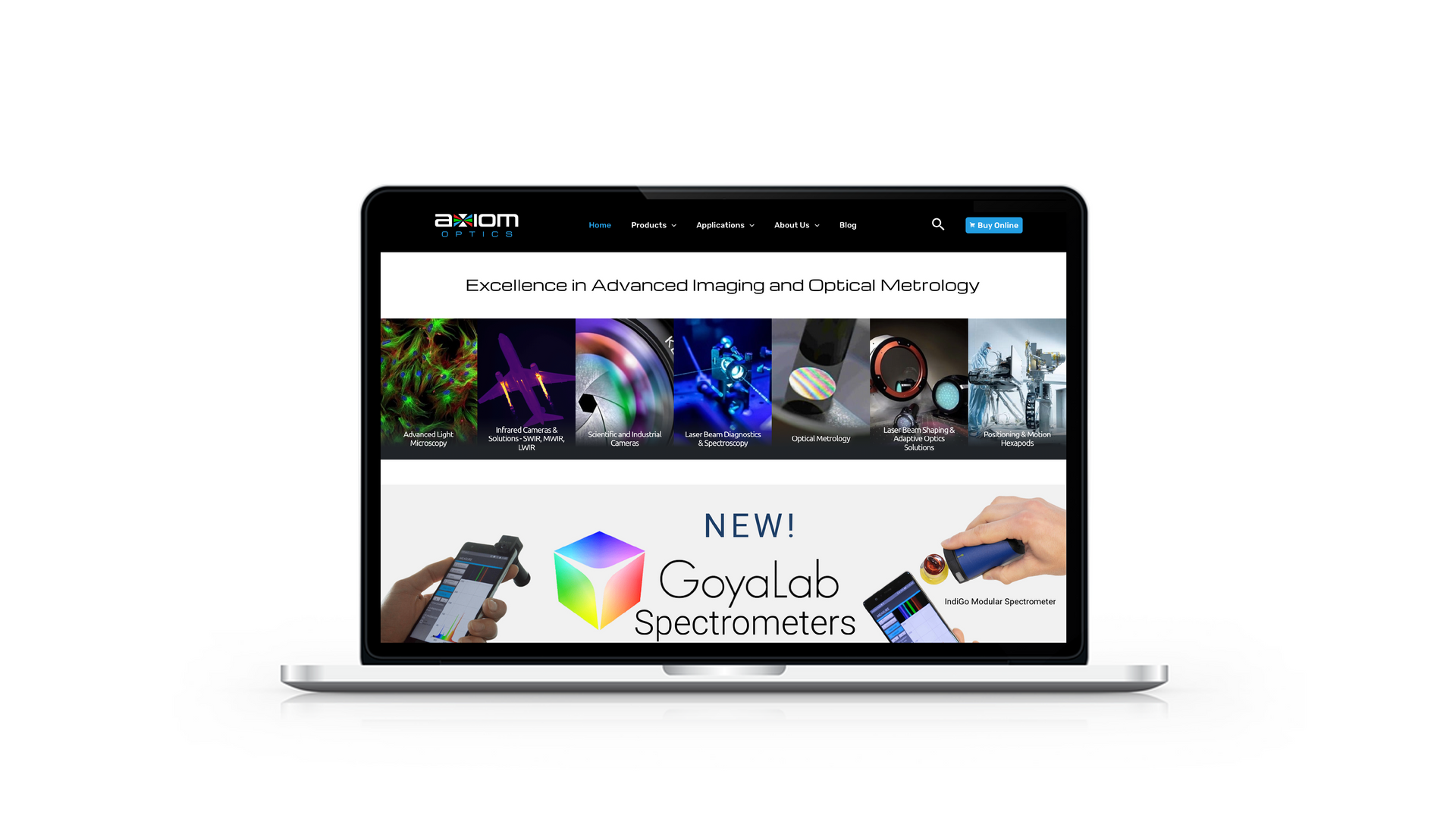
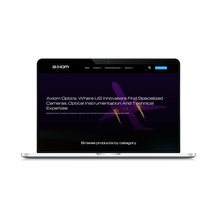
Site web